The Secret to Flawless Web Design: Mastering Responsive Layouts
Ever visited a website that looked great on your laptop but was a total mess on your phone? Maybe the text was too small, the images were all over the place, or buttons were impossible to click. Annoying, right? Well, that’s exactly why responsive web design is a game-changer.
If you’re a web developer (or aspiring to be one), mastering responsive layouts is the secret sauce to making websites look flawless on all devices—whether it’s a massive desktop monitor, a tablet, or a tiny smartphone screen.
What is a Responsive Layout?
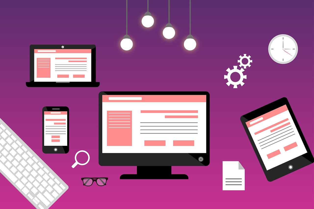
A responsive layout is a web design approach where your website automatically adjusts to fit any screen size. Instead of designing separate sites for desktop and mobile, responsive design ensures one website works everywhere.
Why Does It Matter?
- Better User Experience (UX): No one likes zooming in and out just to read content.
- SEO Boost: Google ranks mobile-friendly websites higher.
- More Conversions: A smooth experience = happy users = more clicks, sign-ups, or sales.
- Less Maintenance: No need to build multiple versions of your site.
Building a Responsive Layout (Step-by-Step Guide)
1. Use a Fluid Grid Instead of Fixed Widths
Instead of using fixed pixel widths, use percentages so elements scale naturally.
<style>
.container {
    width: 80%; /* Instead of fixed pixels */
    max-width: 1200px; /* Prevents it from getting too wide */
    margin: 0 auto;
}
</style>
2. Master CSS Media Queries
Media queries allow you to apply different styles based on screen size.
<style>
@media (max-width: 768px) {
    .container {
        width: 100%;
        padding: 20px;
    }
}
</style>
3. Make Images & Videos Responsive
Use CSS to ensure images scale correctly.
<style>
img {
    max-width: 100%;
    height: auto;
}
</style>
For videos, use aspect ratio tricks:
<style>
.video-wrapper {
    position: relative;
    padding-bottom: 56.25%; /* 16:9 Aspect Ratio */
    height: 0;
}
.video-wrapper iframe {
    position: absolute;
    width: 100%;
    height: 100%;
}
</style>
4. Use Flexbox & Grid for Layouts
Modern CSS layout techniques like Flexbox and CSS Grid make responsiveness easy.
Flexbox for simple alignment:
<style>
.container {
    display: flex;
    flex-wrap: wrap;
    justify-content: space-between;
}
</style>
CSS Grid for advanced layouts:
<style>
.grid-container {
    display: grid;
    grid-template-columns: repeat(auto-fit, minmax(300px, 1fr));
    gap: 20px;
}
</style>
Pro Tip: Use Frameworks Like Bootstrap or Tailwind CSS
If you don’t want to write all the responsive CSS from scratch, use a CSS framework like Bootstrap or Tailwind CSS.
Responsive Bootstrap Grid:
<div class="row">
    <div class="col-md-6 col-sm-12">Left</div>
    <div class="col-md-6 col-sm-12">Right</div>
</div>
Responsive Tailwind CSS Utility Classes:
<div class="w-full sm:w-1/2 md:w-1/3">Content</div>
Testing Your Responsive Layout
Even if you follow all the best practices, always test your design to ensure it looks good on different devices.
Tools to Check Responsiveness:
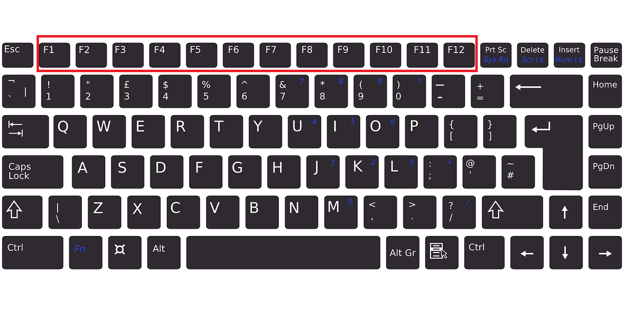
- 📱 Google Chrome DevTools (Press
F12→ Toggle Device Toolbar) - 🌍 Google's Mobile-Friendly Test (Test Here)
- 📏 MDN Web Docs on Media Queries (Read More)
Final Thoughts
Responsive design isn’t just an option anymore—it’s a must-have if you want a website that’s user-friendly, SEO-friendly, and future-proof. By using fluid grids, media queries, flexible images, and modern CSS techniques, you can build layouts that look stunning on any device.
🚀 What’s next? Start experimenting with responsive layouts today and take your web design skills to the next level!
💬 Have questions about responsive design? Drop a comment below!